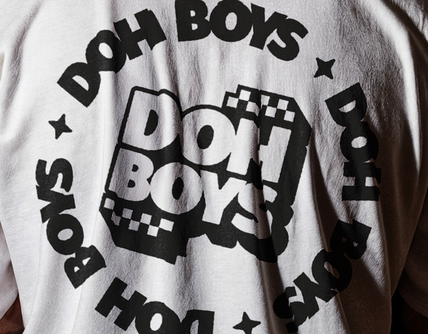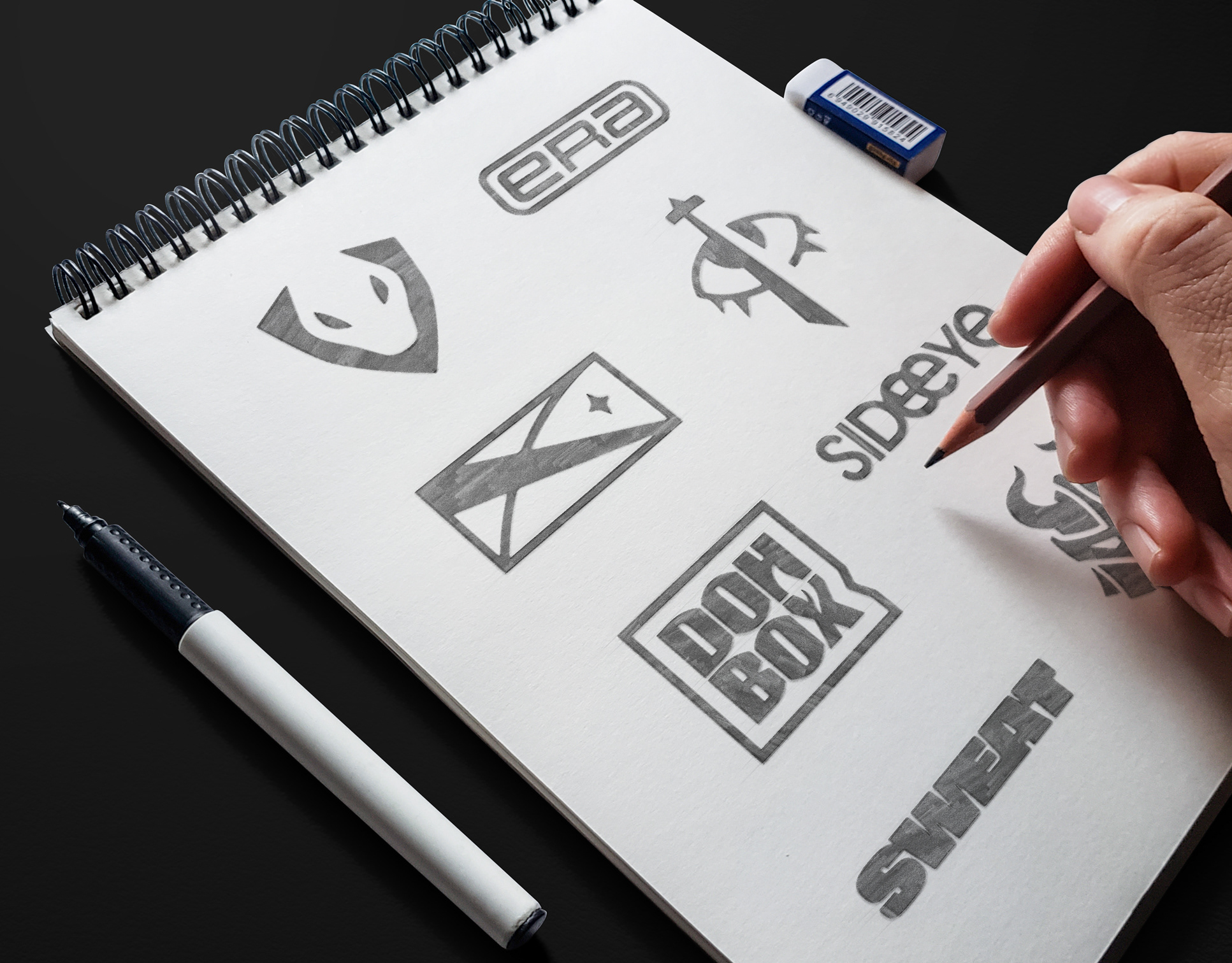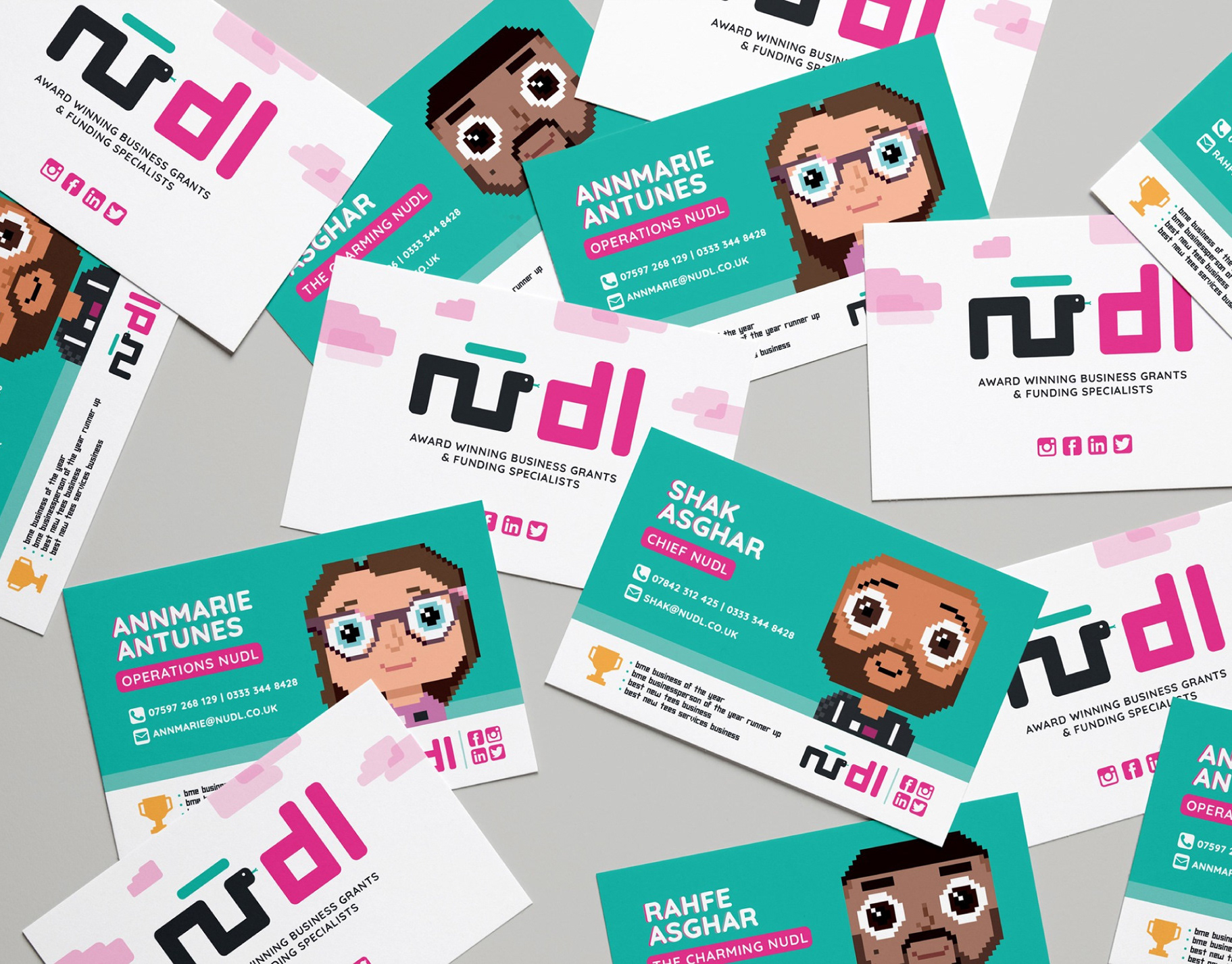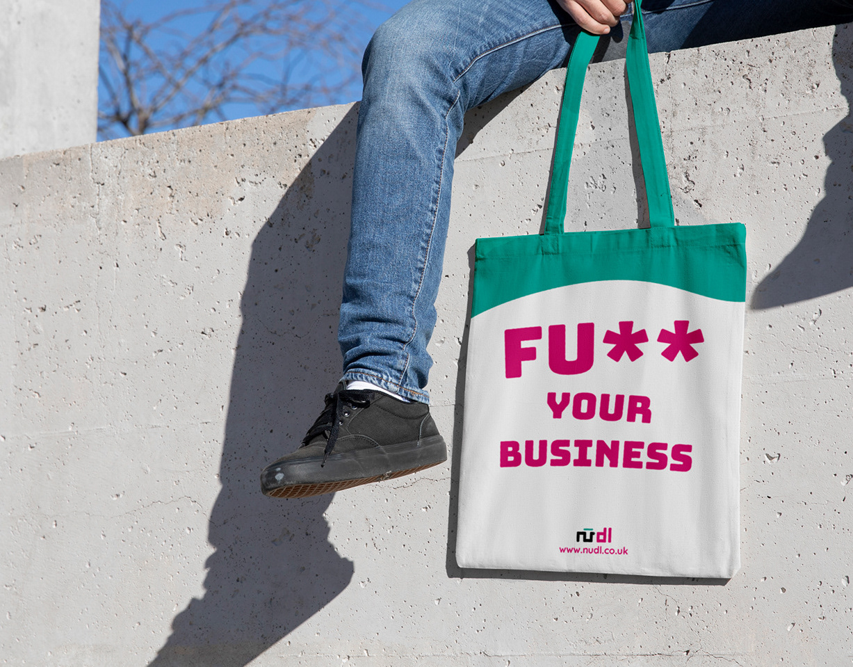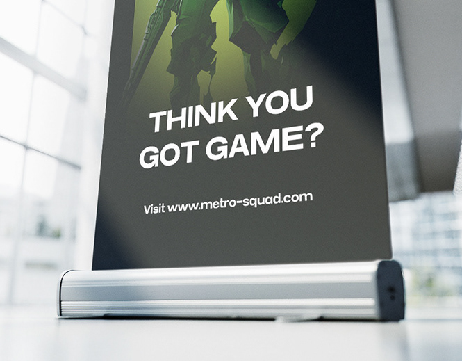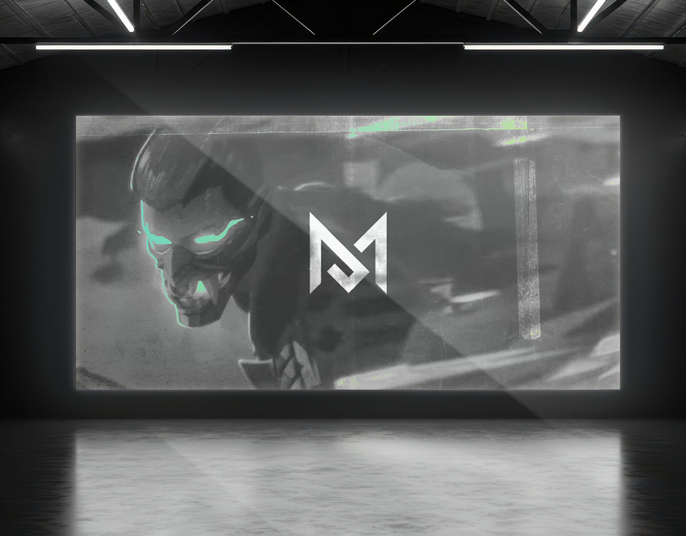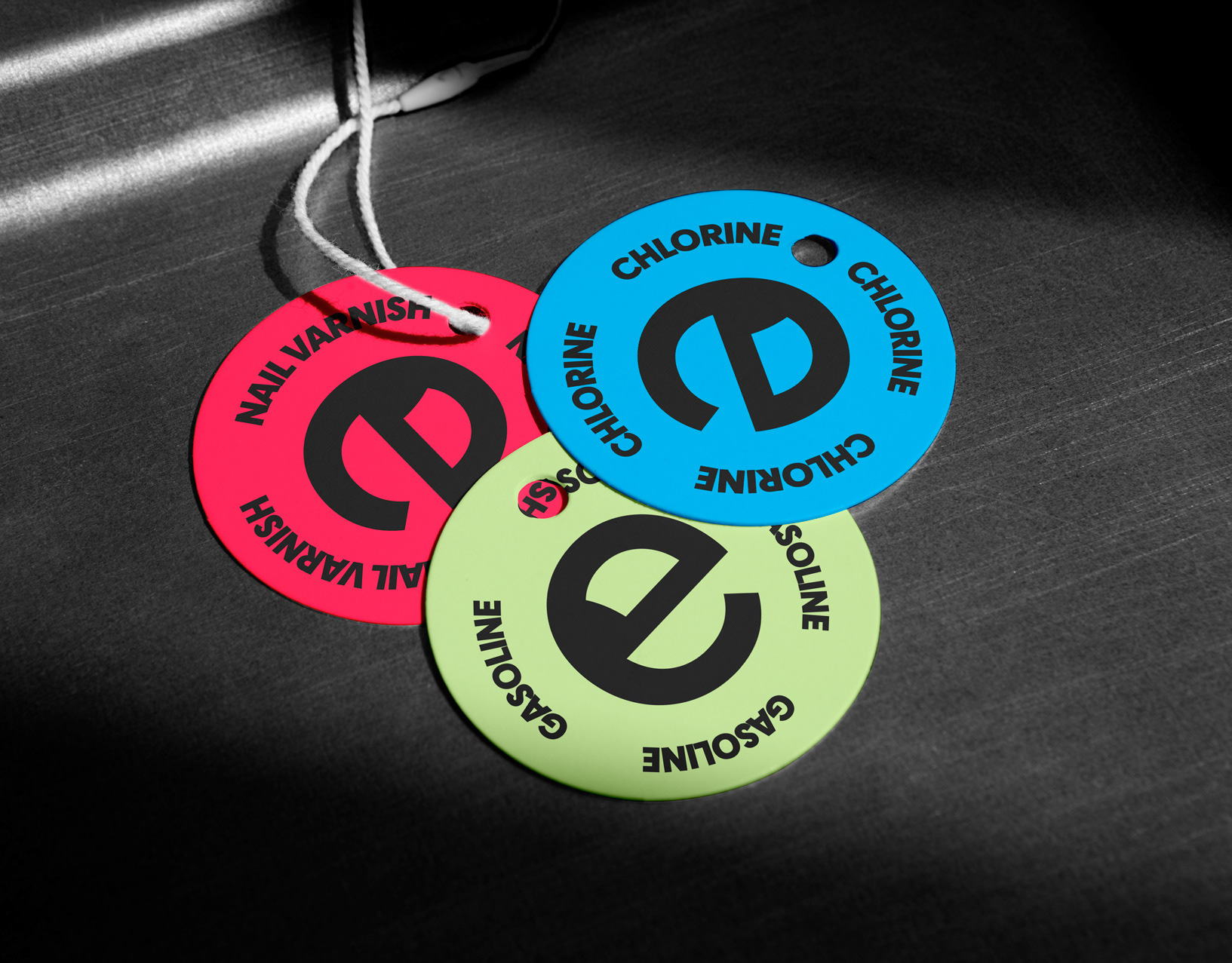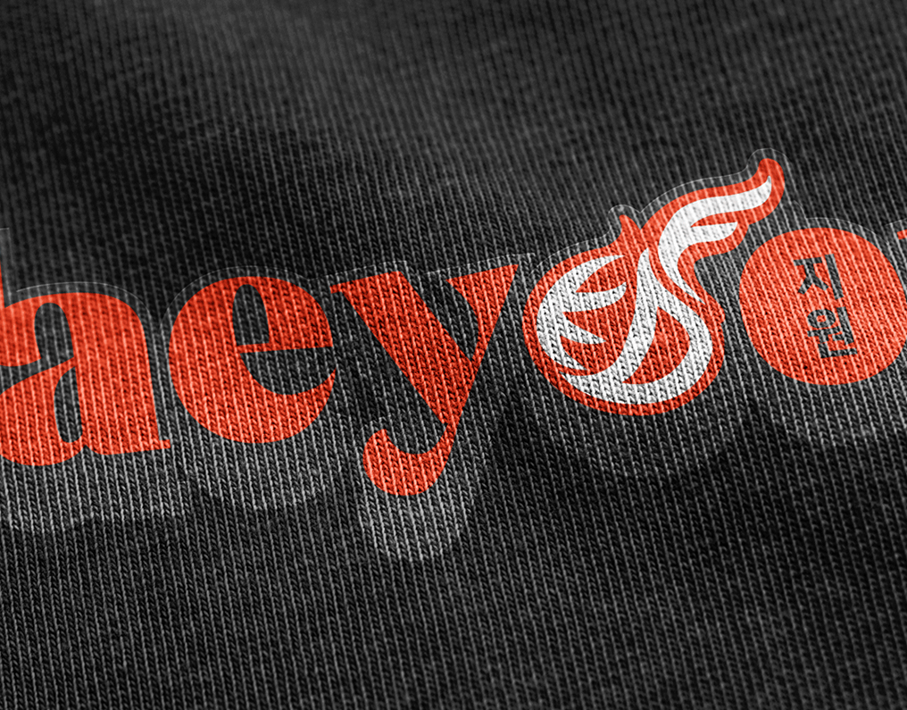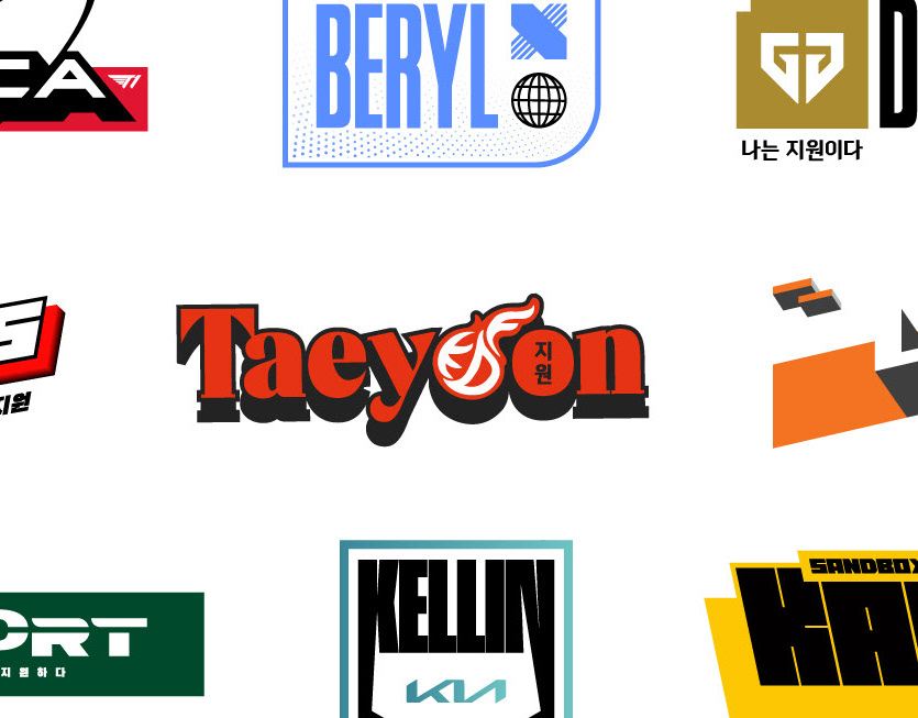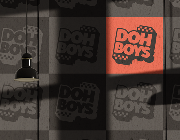
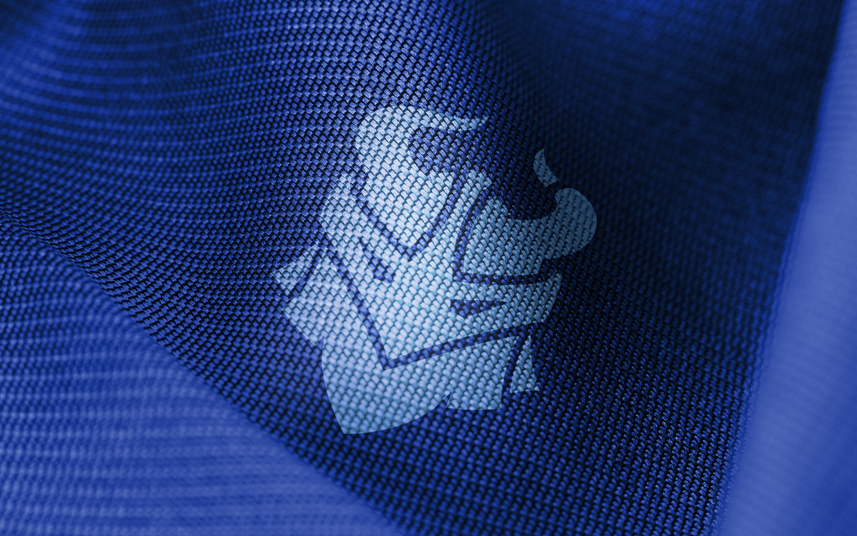
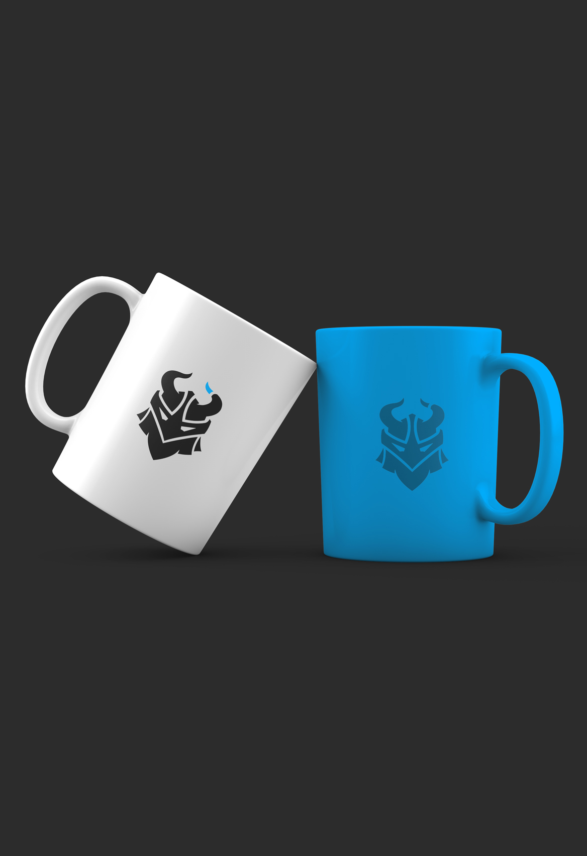
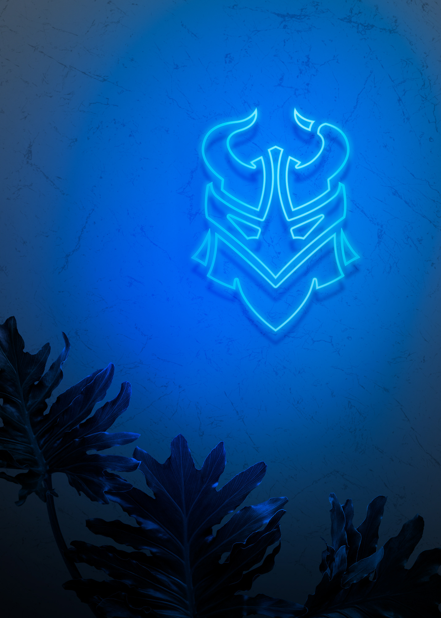
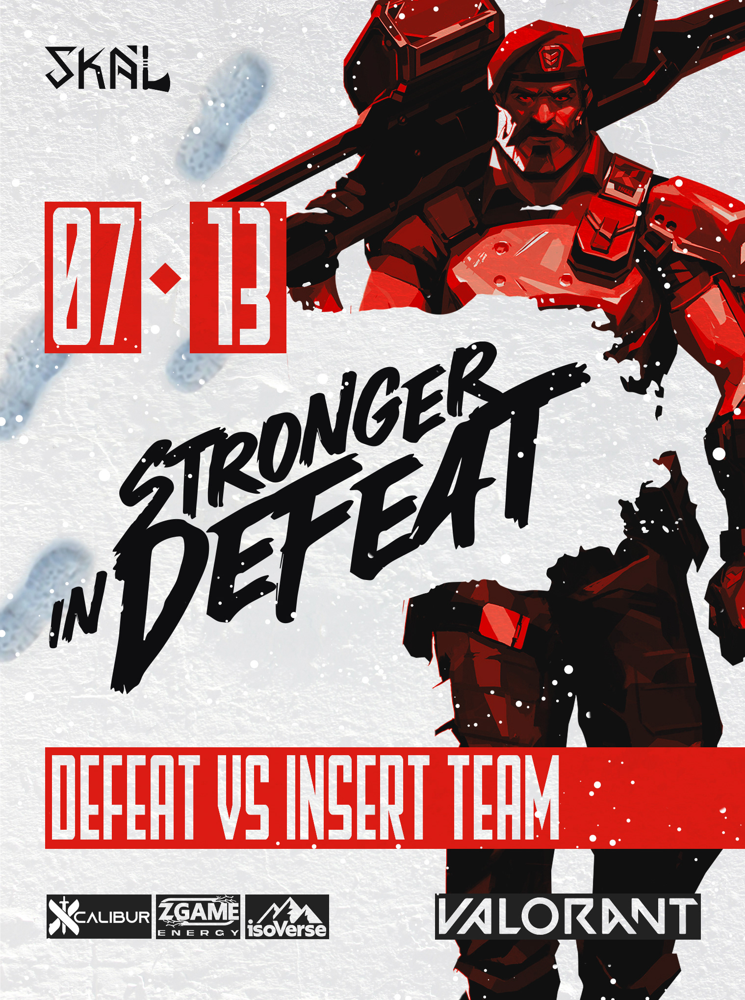
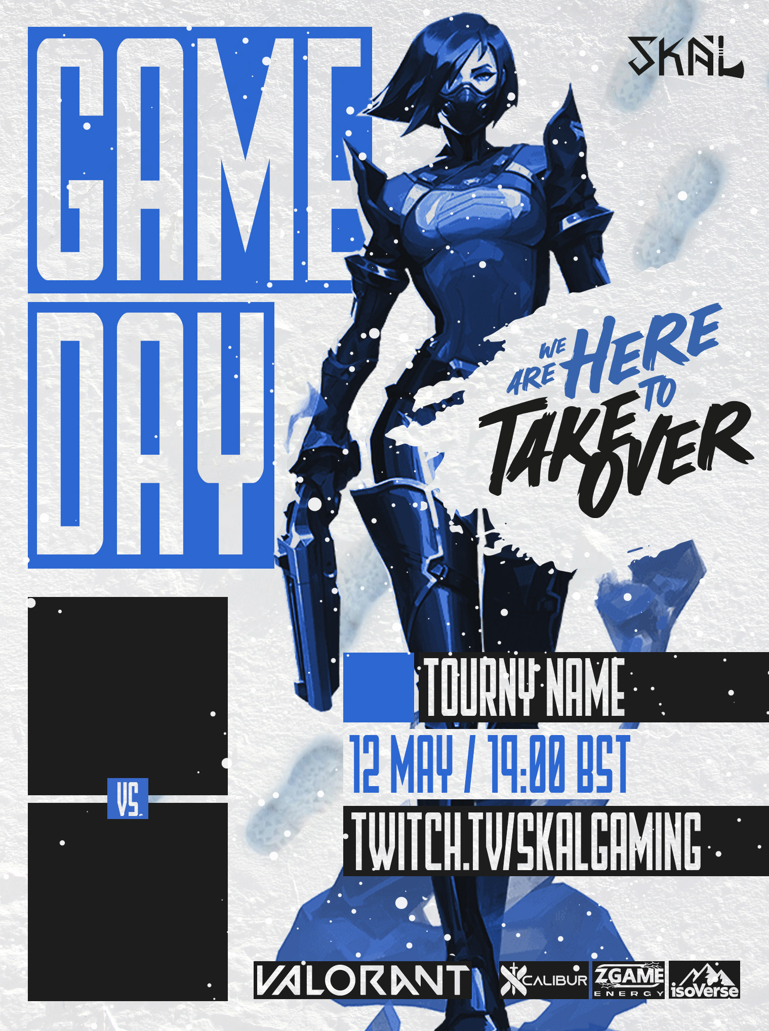
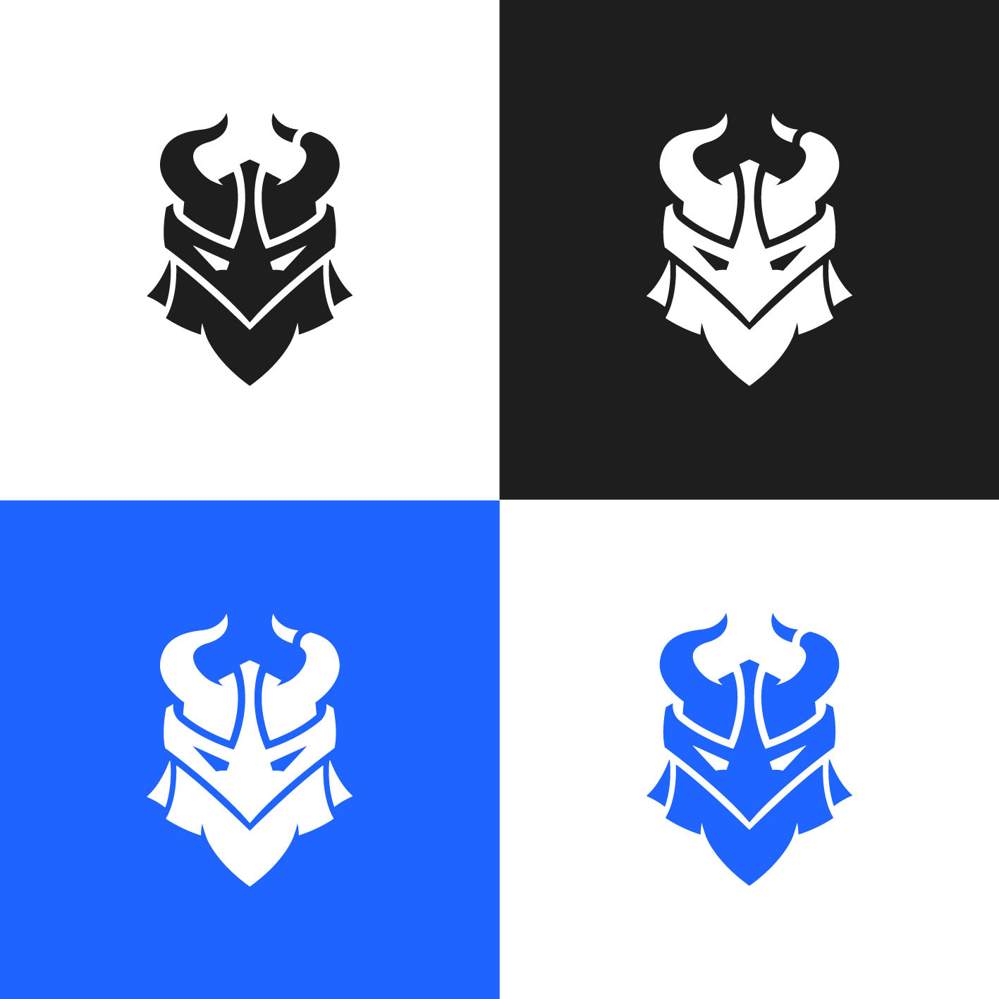


I reworked the logo to give the brand a stronger, more confident identity that could hold up across everything from match graphics to merch and digital content. The mark was simplified and tightened so it’s instantly recognisable, flexible, and easy to scale without losing impact. That logo then became the backbone of the whole visual system, shaping layouts, colour use and overall direction. Everything was built to feel competitive, bold and unmistakably theirs, with the logo doing most of the heavy lifting.