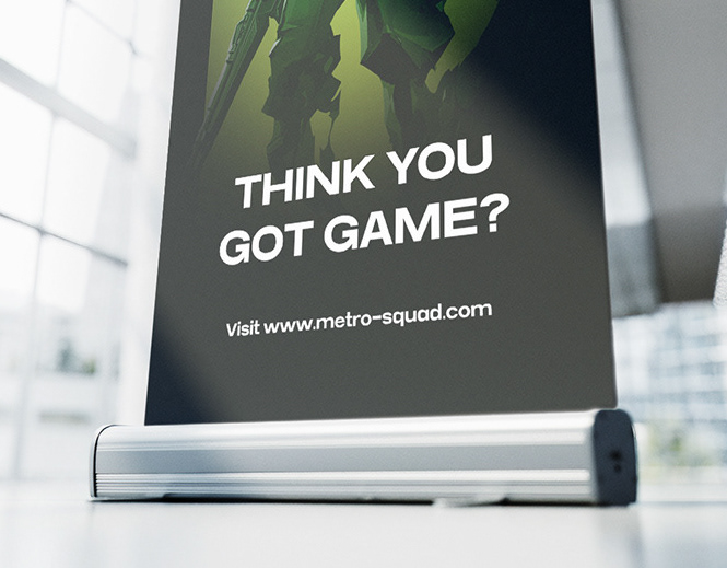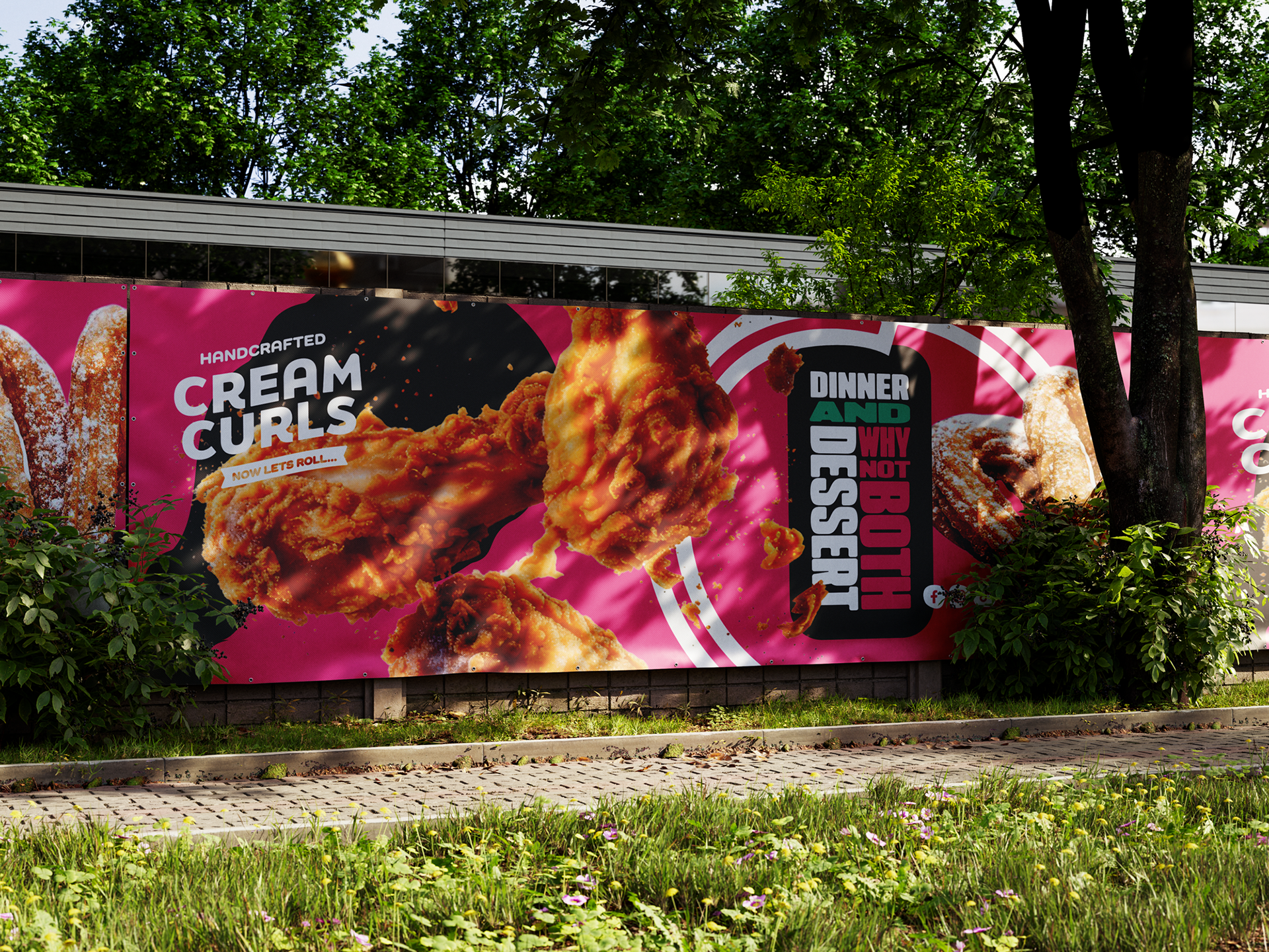
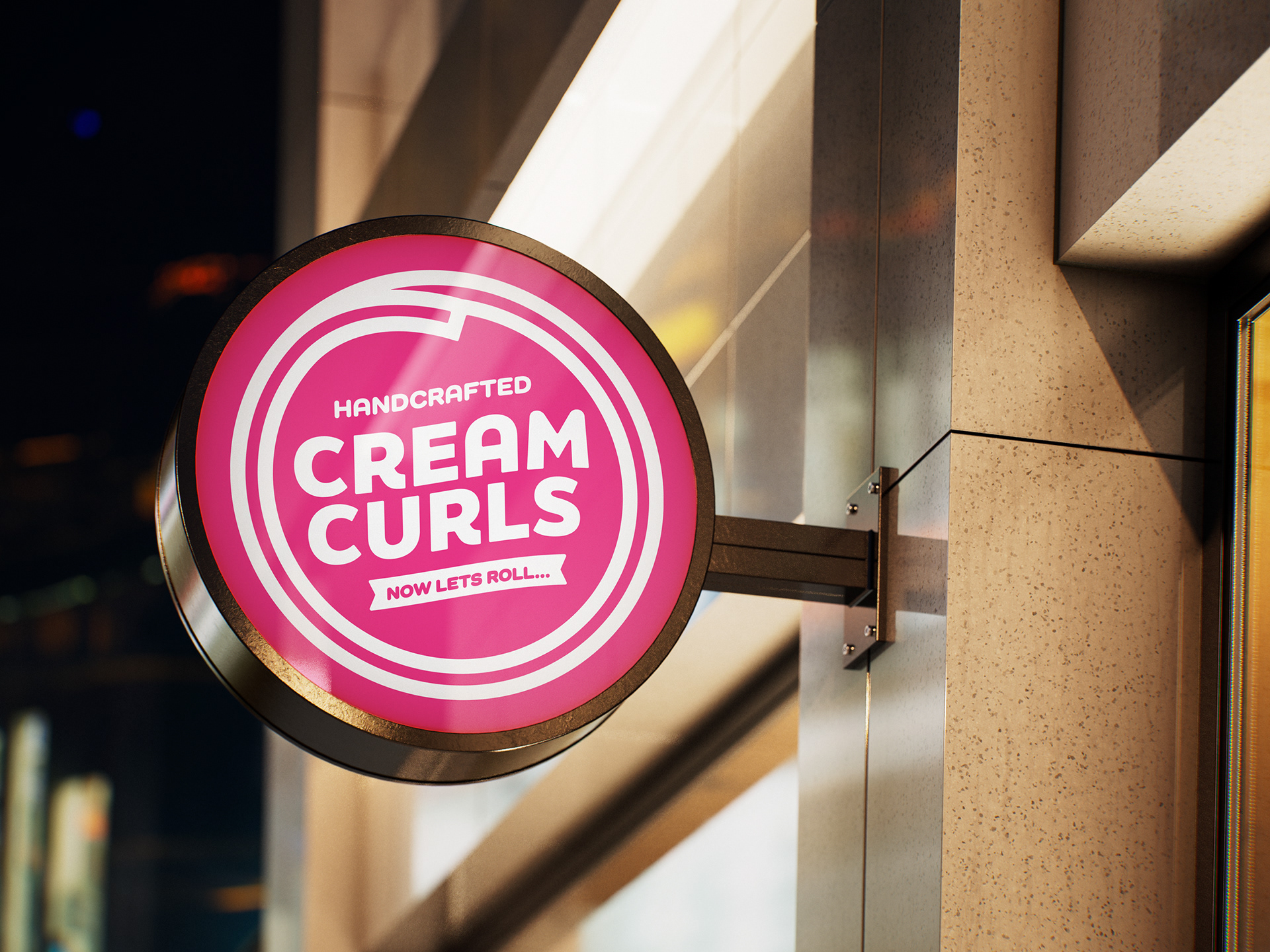
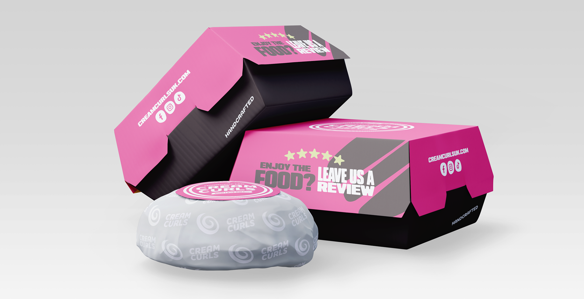
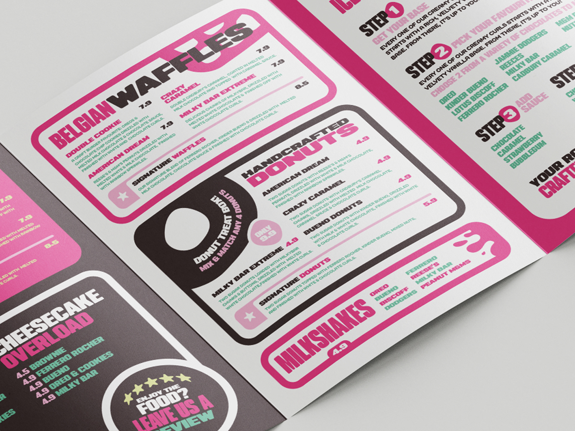
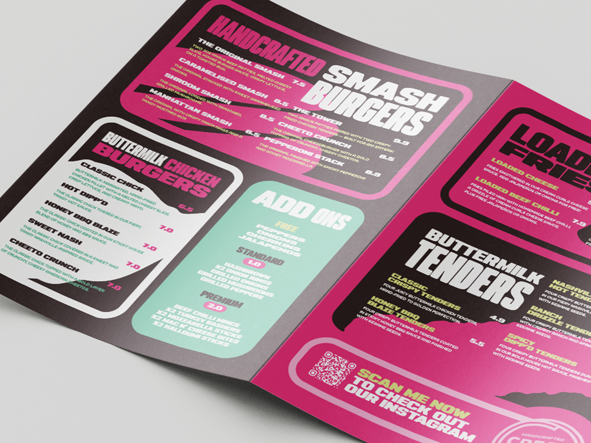
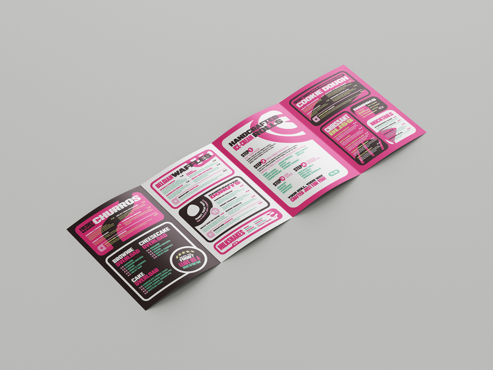
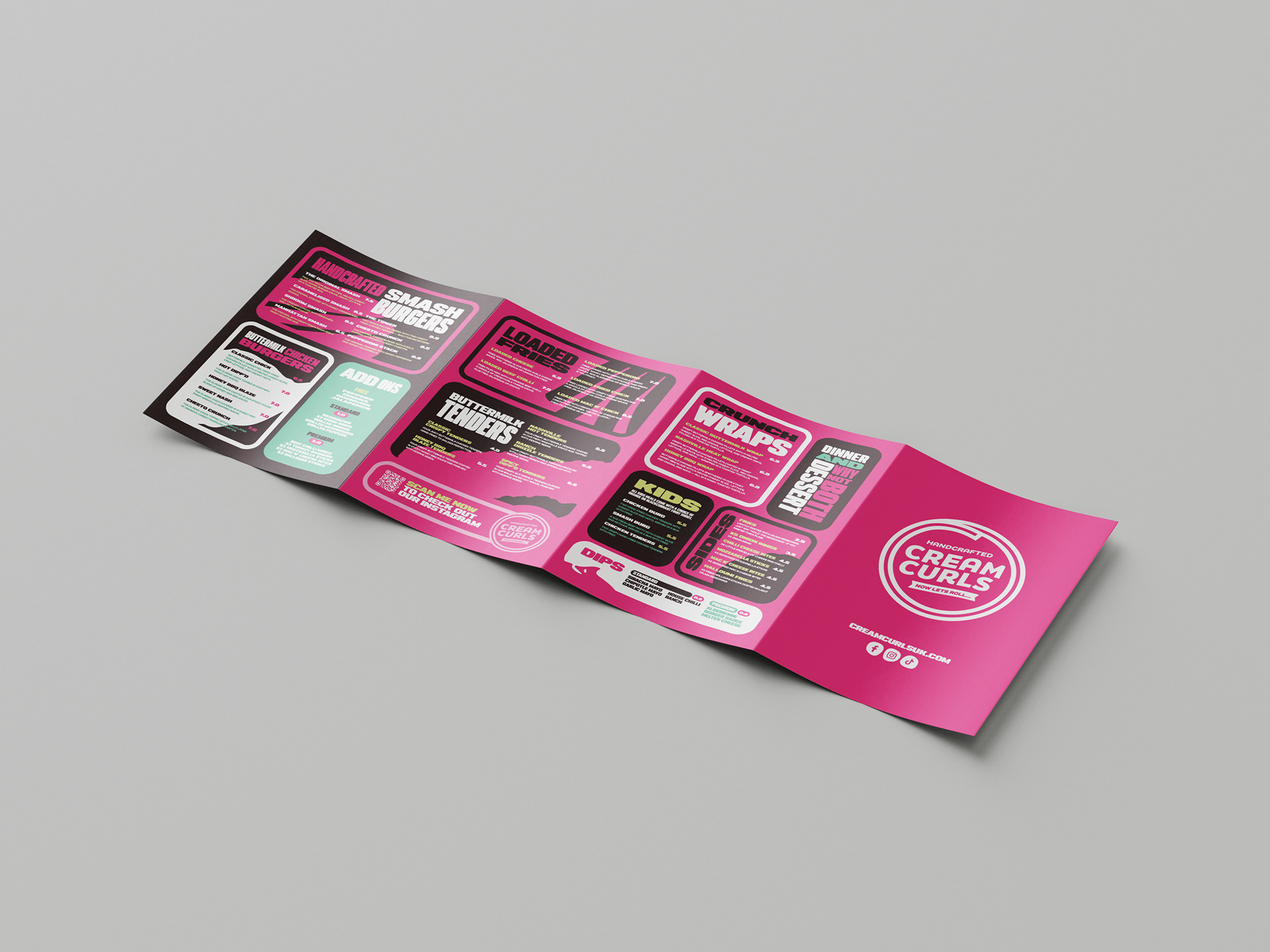


Cream Curls was about having fun and not overthinking it. I made a small tweak to the existing logo, then focused mainly on the menus and wider visual system. For each menu section, I created a simple stylised version of the food to help break things up and make everything easier to scan. Bright pinks, chunky type, and bold layouts do most of the work across menus, packaging, signage, and outdoor pieces. Everything was designed to be clear, eye catching, and easy to use in the real world.